Insight34 min read
A guide to extending Magento page builder
Tue Aug 18 2020 | Marketing Team

- Insight
- Web & eCommerce
- Website development
- Adobe Commerce
Tags
What is Page Builder?
Page Builder has been on Magento’s roadmap for a long time, and as of Magento Commerce 2.3.1, it is now included as standard. The Page Builder feature replaces standard text area fields on content managed pages, blocks and product descriptions, providing a drag and drop stage for the user to enter their information.
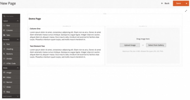
The feature provides an area for the main content of a page, allowing you to drag and drop elements into the locations you want to achieve the desired page layout. This is a huge benefit to the administrator who can now view a close approximation of how a page will look on desktop screens. Currently, Page Builder only provides the layout for desktop screens. However, for smaller screens such as tablets and mobile devices, the page will collapse in a logical way. For instance, columned areas will go from horizontal to vertical with the left-most column being at the top of the stack.
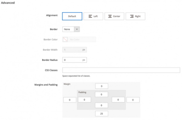
The page is broken down into rows where content can be placed. The administrator can control each element by changing alignment, borders, margins and padding to further tweak the layout of the page if drag and drop isn’t precise enough.
Magento’s Page Builder has been a long-awaited feature and, with it, has brought a range of benefits and new functionalities for developers and administrators alike. There are two main functions of Page Builder that we’re going to talk through further – extending a content type and creating a new content type.
Extensibility
Page Builder provides the opportunity to add layout and content elements including columns and tabbed areas alongside media blocks such as images, video, sliders and even maps. Using this feature, the administrator can also add CMS blocks and products to a page, as well as using the more advanced features of Commerce by leveraging dynamic blocks. Dynamic blocks are very powerful tools, providing content to the customer based on price rules for products and customer segmentations.
As if these functions weren’t enough, it is also possible to extend Page Builder and provide custom widgets to expose more content and elements to the system. Page Builder gives administrators the ability to customise pre-existing widgets by extending them, or creating whole new ones for use on a page.
Extending a content type
Extending a content type is the easiest way to customise Page Builder. It allows you to create a new appearance that changes how the existing content type looks, or, set properties that do not exist on the existing content type. Appearances can be used to change content types by:
- Adding new style properties
- Adding or changing templates
- Adding to or changing existing forms
- Adding new attributes
- Moving data between elements
Creating a new content type
Page Builder comes with various content types that can be used to build pages within a Magento store, such as images, videos, text, headings and buttons to name a few.
Although there are plenty of controls to get you started, you may need to add some new functionality that isn’t included out of the box. This is where Page Builder’s ability to create new content types comes in very handy. Creating a new content type allows you to build a separate module within Magento that will add to Page Builder, providing extra flexibility to your page designs within the editor.
Page Builder in action
The project
When using Page Builder for one of our clients we needed to create a new content type. Rather than extending something that was already there but not quite the right fit, we decided it would be more effective to create a new control so we could better fit our client’s requirements.
We needed a block of text that was independent of a standard text block to be the first paragraph of text on a page. This was done intentionally so we didn’t have to rely on the administrator adding a specific class to the paragraph to target it with CSS. Providing a separate element also allows the styling for the page to stay uniform rather than letting the administrator manually set the style for the text block. This way, it preserves the design aesthetic keeping it the same no matter where the block is used.
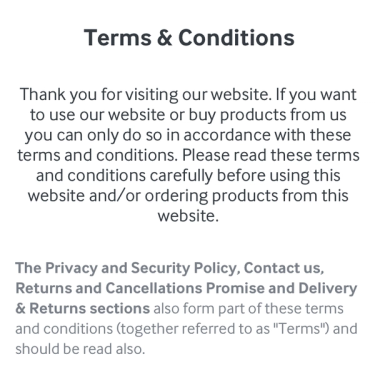
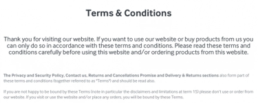
To do this, we could have simply created an appearance for the text control. But the reason we decided to create our own was to keep control over the styling and ensure aesthetics stayed in line with the design. It also gave the client some ongoing control over frontend aspects. The designs below show what the client was expecting in terms of aesthetics. It was up to us to provide the finished result in an easy to manage way.
How is this done?
Adding a new content type essentially provides another layout option within an existing block. Initially, creating a content type for Page Builder is the same as creating any other module for Magento 2. There is a naming convention to follow for naming the module and that is to prefix the module name with ‘PageBuilder’. You then need to create registration.php and etc/module.xml files so that Magento is aware of the new module.
The registration.php file is very much like that of any other module being created.
The module.xml file should look like this, including a <sequence> node that tells Magento to load our module after the Magento_PageBuilder module.
<?xml version="1.0"?>
<config xmlns:xsi="http://www.w3.org/2001/XMLSchema-instance"
xsi:noNamespaceSchemaLocation="urn:magento:framework:Module/etc/module.xsd">
 <module name="Pinpoint_PageBuilderLeadText" setup_version="1.0.0">
 <sequence>
 <module name="Magento_PageBuilder"/>
 </sequence>
 </module>
</config>
Once these files are created, you will be able to register it with Magento by running bin/magento setup:upgrade.
Configuration
The next step is to add configuration for the content type. This file is created at view/adminhtml/pagebuilder/content_type/. The file name should be the name of your module namespace, followed by the title of your module separated by an underscore (in this case, pinpoint_leadtext). The file contents look like this:
<type name="pinpoint_leadtext"
 label="Lead Text"
 menu_section="elements"
 component="Magento_PageBuilder/js/content-type"
 preview_component="Magento_PageBuilder/js/content-type/preview"
 master_component="Magento_PageBuilder/js/content-type/master"
 form="pagebuilder_pinpoint_leadtext_form"
 icon="icon-pagebuilder-text"
 sortOrder="10"
 translate="label">
 ...
</type>
The type node defines the primary properties of the content type. You can read more about this in Magento’s online DevDocs or alternatively, contact our team for more information on this topic.
<children default_policy="deny"/>
<parents default_policy="deny">
 <parent name="column" policy="allow"/>
 <parent name="row" policy="allow"/>
</parents>
The children node defines whether the content type can contain other content types within Page Builder. In this case, we are creating a content block, rather than a layout, so this is set to deny. Likewise, the parent node defines if this content type can be placed as a child to other content types. In this module, we want to do this so we’re able to put it within layout components.
<appearances>
 <appearance name="default"
 default="true"
 preview_template="Pinpoint_PageBuilderLeadText/content-type/pinpoint-leadtext/
default/preview"
 master_template="Pinpoint_PageBuilderLeadText/content-type/pinpoint-leadtext/
default/master"
 reader="Magento_PageBuilder/js/master-format/read/configurable">
 ...
 </appearance>
</appearances>
The appearances node lays out how many possible arrangements of the content can be selected. A prime example would be on the banner element that comes packaged with Page Builder:

This shows there are four different styles that you can select from to arrange the banner, and how it will be shown on the frontend of the website. For this module, we only need the one appearance so we just created the default node. Each appearance has two templates associated with it, one for the admin preview and one for the front end of the website.
<elements>
 <element name="main">
 <style name="text_align" source="text_align"/>
 <style name="border" source="border_style" converter="Magento_PageBuilder/js/
converter/style/border-style"/>
 <style name="border_color" source="border_color"/>
 <style name="background_color" source="background_color"/>
 <style name="background_image" source="background_image"
converter="Magento_PageBuilder/js/converter/style/background-image"
preview_converter="Magento_PageBuilder/js/converter/style/preview/background-image"/>
 <style name="border_width" source="border_width" converter="Magento_PageBuilder/js/
converter/style/border-width"/>
 <style name="border_radius" source="border_radius" converter="Magento_PageBuilder/
js/converter/style/remove-px"/>
 <style name="margins" storage_key="margins_and_padding" reader="Magento_PageBuilder/
js/property/margins" converter="Magento_PageBuilder/js/converter/style/margins"/>
 <style name="padding" storage_key="margins_and_padding" reader="Magento_PageBuilder/
js/property/paddings" converter="Magento_PageBuilder/js/converter/style/paddings"/>
 <style name="display" source="display" converter="Magento_PageBuilder/js/converter/
style/display" preview_converter="Magento_PageBuilder/js/converter/style/preview/display"/>
 <attribute name="name" source="data-content-type"/>
 <attribute name="appearance" source="data-appearance"/>
 <css name="css_classes"/>
 </element>
 <element name="leadtext">
 <style name="text_align" source="text_align"/>
 <html name="leadtext" converter="Magento_PageBuilder/js/converter/html/tag-escaper"/
>
 <css name="leadtext_css"/>
 </element>
</elements>
The elements node allows us to select which of the advanced display options the administrator can add padding or margin, borders or background colour/images to. This node lets us map the content type editor form so that set values are stored and can be recalled in the correct manner. When it’s all put together, the file looks like this:
<?xml version="1.0"?>
<config xmlns:xsi="http://www.w3.org/2001/XMLSchema-instance"
xsi:noNamespaceSchemaLocation="urn:magento:module:Magento_PageBuilder:etc/content_type.xsd">
 <type name="pinpoint_leadtext"
 label="Lead Text"
 menu_section="elements"
 component="Magento_PageBuilder/js/content-type"
 preview_component="Magento_PageBuilder/js/content-type/preview"
 master_component="Magento_PageBuilder/js/content-type/master"
 form="pagebuilder_pinpoint_leadtext_form"
 icon="icon-pagebuilder-text"
 sortOrder="10"
 translate="label">
 <children default_policy="deny"/>
 <parents default_policy="deny">
 <parent name="column" policy="allow"/>
 <parent name="row" policy="allow"/>
 </parents>
 <appearances>
 <appearance name="default"
 default="true"
 preview_template="Pinpoint_PageBuilderLeadText/content-type/pinpointleadtext/default/preview"
 master_template="Pinpoint_PageBuilderLeadText/content-type/pinpointleadtext/default/master"
 reader="Magento_PageBuilder/js/master-format/read/configurable">
 <elements>
 <element name="main">
 <style name="text_align" source="text_align"/>
 <style name="border" source="border_style"
converter="Magento_PageBuilder/js/converter/style/border-style"/>
 <style name="border_color" source="border_color"/>
 <style name="background_color" source="background_color"/>
 <style name="background_image" source="background_image"
converter="Magento_PageBuilder/js/converter/style/background-image"
preview_converter="Magento_PageBuilder/js/converter/style/preview/background-image"/>
 <style name="border_width" source="border_width"
converter="Magento_PageBuilder/js/converter/style/border-width"/>
 <style name="border_radius" source="border_radius"
converter="Magento_PageBuilder/js/converter/style/remove-px"/>
 <style name="margins" storage_key="margins_and_padding"
reader="Magento_PageBuilder/js/property/margins" converter="Magento_PageBuilder/js/
converter/style/margins"/>
 <style name="padding" storage_key="margins_and_padding"
reader="Magento_PageBuilder/js/property/paddings" converter="Magento_PageBuilder/js/
converter/style/paddings"/>
 <style name="display" source="display" converter="Magento_PageBuilder/
js/converter/style/display" preview_converter="Magento_PageBuilder/js/converter/style/
preview/display"/>
 <attribute name="name" source="data-content-type"/>
 <attribute name="appearance" source="data-appearance"/>
 <css name="css_classes"/>
 </element>
 <element name="leadtext">
 <style name="text_align" source="text_align"/>
 <html name="leadtext" converter="Magento_PageBuilder/js/converter/html/
tag-escaper"/>
 <css name="leadtext_css"/>
 </element>
 </elements>
 </appearance>
 </appearances>
 </type>
</config>
Templates
Next up is to continue creating the templates for the widget. As mentioned in the previous section, there are two templates needed for each appearance. In this case, we only need one appearance so that means we need two templates.
The convention around these templates is to create two files. master.html and preview.html. master.html controls how the widget will display on the front end of the website, while preview.html is how the widget looks in the backend configuration. These two files need to be created within the module at view/adminhtml/web/template/content-type/pinpoint-leadtext/default (where the last two elements of the path are the widget name / appearance name).

From the appearance node in the configuration above, you can define where the templates are:
<appearance name="default"
default="true"
preview_template="Pinpoint_PageBuilderLeadText/content-type/pinpoint-leadtext/default/
preview"
master_template="Pinpoint_PageBuilderLeadText/content-type/pinpoint-leadtext/default/master"
reader="Magento_PageBuilder/js/master-format/read/configurable">
The reader attribute in the example above tells the appearance of the location of the master format for instruction on how it handles the information. The master.html file for our widget ended up looking like this:
<div attr="data.main.attributes">
 <div class="pb__lead-text"
 attr="data.leadtext.attributes"
 ko-style="data.leadtext.style"
 css="data.leadtext.css"
 html="data.leadtext.html">
 </div>
</div>
The above is simply plain HTML with special attributes that are required by Page Builder. Here it is explained in a bit more depth:
attr:Theattattribute facilitates the binding of information from the content type form to the template. The element node from the configuration file name is used here to provide a link between the appearance and the configuration. In this case, the element name is‘leadtext’so it is linked to theattrattributedata.leadtext.attributes.ko-style: In much the same way as theattrattribute,ko-style, connects the template to the styles that can be defined in the admin. This includes factors such as the margin, padding, border and backgrounds. They are read from the definition of the widget and translated into inline styles on the block on the frontend. The naming convention of this also follows the same as above - data..style.- css: The css attribute applies any classes that were entered by the administrator when defining the widget in the admin. The naming convention of this element is also the same as above.
class: This attribute allows us to set a CSS class for any base styling that the administrator can’t manipulate from the admin. In this
example, we have usedpb__lead-textto target the block from the website theme stylesheet.html: This connects user-entered HTML content. It can be entered in the form or directly on to the preview in the admin panel.
There are a couple of extra fields needed on the preview.html template. Our file looks like this:
<div attr="data.main.attributes"
ko-style="data.main.style"
class="pagebuilder-content-type"
css="data.main.css"
event="{ mouseover: onMouseOver, mouseout: onMouseOut }, mouseoverBubble: false">
<render args="getOptions().template" />
<div attr="data.leadtext.attributes"
ko-style="data.leadtext.style"
css="data.leadtext.css"
data-bind="liveEdit: { field: 'leadtext', placeholder: $t('Enter Lead Text') }">
</div>
</div>
On the wrapping div, there is a new event attribute. This tells Page Builder how to react when someone interacts with the block on the preview stage. If you need the widget to do something, in particular, you can enter those actions here. liveEdit enables the widget to be edited on the preview stage. This is assigned using the data-bind attribute, as used for KnockoutJS.
Forms
Forms are important in a Page Builder widget as they provide the fields for entering data to display on the frontend alongside styling and layout tweaks.
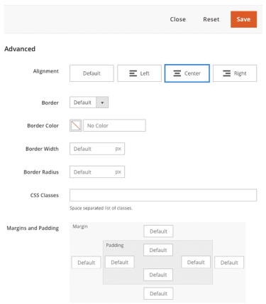
Using Page Builder, you can access a form by clicking the element settings on the preview stage in the admin, or by enabling LiveEdit within the template (as seen above). However, if you include a form, you are also giving the administrator access to the advanced controls for any layout adjustments such as spacing, backgrounds and additional custom CSS classes for that element, rather than just adding those to the wrapping container. Out of the box, Page Builder supplies two forms to provide base functionality for your forms:
pagebuilder_base_formprovides us with the advanced controls shown near the start of this article:
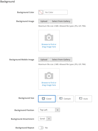
pagebuilder_base_form_with_background_attributesprovides all the fields from above, plus the following fields that reside in a background section:
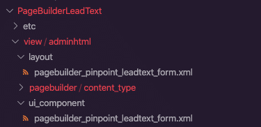
To add the form and layout files, this can be done in:
/view/adminhtml/layout/pagebuilder_pinpoint_leadtext_form.xml
/view/adminhtml/ui_component/pagebuilder_pinpoint_leadtext_form.xml
pagebuilder_base_form_with_background_attributesprovides all the fields from above, plus the following fields that reside in a background section:
Within the configuration file, we set an attribute called ‘form’ which will tell the module where to find the form. In the ui_component directory, we tell our module that the form we’re using will inherit from pagebuilder_base_form, as we don’t need the background fields for this module. This is a large file, with four main chunks:
<argument name="data" xsi:type="array">
<item name="js_config" xsi:type="array">
<item name="provider"
xsi:type="string">pagebuilder_pinpoint_leadtext_form.pagebuilder_pinpoint_leadtext_form_data
_source</item>
</item>
<item name="label" xsi:type="string" translate="true">LeadText</item>
</argument>
The argument node lets Magento and Page Builder know basic information on what is happening within the form, including where to manage the data to and from within the provider item.
<settings>
<namespace>pagebuilder_pinpoint_leadtext_form</namespace>
<deps>
<dep>pagebuilder_pinpoint_leadtext_form.pagebuilder_pinpoint_leadtext_form_data_source</dep>
</deps>
</settings>
The settings node lays out the namespace for the form, as well as any dependencies for the form.
<dataSource name="pagebuilder_pinpoint_leadtext_form_data_source">
<argument name="data" xsi:type="array">
<item name="js_config" xsi:type="array">
<item name="component" xsi:type="string">Magento_PageBuilder/js/form/provider</
item>
</item>
</argument>
<dataProvider name="pagebuilder_pinpoint_leadtext_form_data_source"
class="Magento\PageBuilder\Model\ContentType\DataProvider">
<settings>
<requestFieldName/>
<primaryFieldName/>
</settings>
</dataProvider>
</dataSource>
The dataSource node declares where the configuration for the widget is kept, as well as outlining the actual data source and any settings relating to that.
<fieldset name="appearance_fieldset" sortOrder="10" component="Magento_PageBuilder/js/form/
element/dependent-fieldset">
<settings>
<label translate="true">Appearance</label>
<additionalClasses>
<class name="admin__fieldset-visual-select-large">true</class>
</additionalClasses>
<collapsible>false</collapsible>
<opened>true</opened>
<imports>
<link name="hideFieldset">${$.name}.appearance:options</link>
<link name="hideLabel">${$.name}.appearance:options</link>
</imports>
</settings>
<field name="appearance" formElement="select" sortOrder="10"
component="Magento_PageBuilder/js/form/element/dependent-visual-select">
<argument name="data" xsi:type="array">
<item name="config" xsi:type="array">
<item name="default" xsi:type="string">default</item>
</item>
</argument>
<settings>
<additionalClasses>
<class name="admin__field-wide">true</class>
<class name="admin__field-visual-select-container">true</class>
</additionalClasses>
<dataType>text</dataType>
<validation>
<rule name="required-entry" xsi:type="boolean">true</rule>
</validation>
<elementTmpl>Magento_PageBuilder/form/element/visual-select</elementTmpl>
</settings>
<formElements>
<select>
<settings>
<options class="AppearanceSourceLeadText"/>
</settings>
</select>
</formElements>
</field>
</fieldset>
<fieldset name="general" sortOrder="20">
<settings>
<label/>
</settings>
<field name="leadtext" sortOrder="10" formElement="textarea">
<argument name="data" xsi:type="array">
<item name="config" xsi:type="array">
<item name="source" xsi:type="string">page</item>
</item>
</argument>
<settings>
<dataScope>leadtext</dataScope>
<dataType>text</dataType>
<label translate="true">LeadText</label>
</settings>
</field>
</fieldset>
There are two fieldset nodes defined here. The first sets up the default appearance for our module, and the second includes the fields we are adding to the form. The fieldset nodes have two main elements.fieldset which wraps all the field nodes - it’s name should match the name used on the fieldset from the module’s form. The appearance_fieldset is used by all content type forms and should have a small sortOrder so that it appears at the top of the display.
field describes the name of the field, where it appears within the parent fieldset and the form element that is to display on the form to accept the data from the administrator. Within the field nodes there are arguments and settings.
argumentsprovide a way to add default values to fields, or other arguments that you need to pass along, such as the source we used.settingsprovide Page Builder with information relating to the rendering of the field, including the type of data it should be expecting for validation and a label for the field to appear on the form.
When it is all put together, our form within the ui_component directory looks like this:
<?xml version="1.0" encoding="UTF-8"?>
<form xmlns:xsi="http://www.w3.org/2001/XMLSchema-instance"
xsi:noNamespaceSchemaLocation="urn:magento:module:Magento_Ui:etc/ui_configuration.xsd"
extends="pagebuilder_base_form">
<argument name="data" xsi:type="array">
<item name="js_config" xsi:type="array">
<item name="provider"
xsi:type="string">pagebuilder_pinpoint_leadtext_form.pagebuilder_pinpoint_leadtext_form_data
_source</item>
</item>
<item name="label" xsi:type="string" translate="true">LeadText</item>
</argument>
<settings>
<namespace>pagebuilder_pinpoint_leadtext_form</namespace>
<deps>
<dep>pagebuilder_pinpoint_leadtext_form.pagebuilder_pinpoint_leadtext_form_data_source</dep>
</deps>
</settings>
<dataSource name="pagebuilder_pinpoint_leadtext_form_data_source">
<argument name="data" xsi:type="array">
<item name="js_config" xsi:type="array">
<item name="component" xsi:type="string">Magento_PageBuilder/js/form/
provider</item>
</item>
</argument>
<dataProvider name="pagebuilder_pinpoint_leadtext_form_data_source"
class="Magento\PageBuilder\Model\ContentType\DataProvider">
<settings>
<requestFieldName/>
<primaryFieldName/>
</settings>
</dataProvider>
</dataSource>
<fieldset name="appearance_fieldset" sortOrder="10" component="Magento_PageBuilder/js/
form/element/dependent-fieldset">
<settings>
<label translate="true">Appearance</label>
<additionalClasses>
<class name="admin__fieldset-visual-select-large">true</class>
</additionalClasses>
<collapsible>false</collapsible>
<opened>true</opened>
<imports>
<link name="hideFieldset">${$.name}.appearance:options</link>
<link name="hideLabel">${$.name}.appearance:options</link>
</imports>
</settings>
<field name="appearance" formElement="select" sortOrder="10"
component="Magento_PageBuilder/js/form/element/dependent-visual-select">
<argument name="data" xsi:type="array">
<item name="config" xsi:type="array">
<item name="default" xsi:type="string">default</item>
</item>
</argument>
<settings>
<additionalClasses>
<class name="admin__field-wide">true</class>
<class name="admin__field-visual-select-container">true</class>
</additionalClasses>
<dataType>text</dataType>
<validation>
<rule name="required-entry" xsi:type="boolean">true</rule>
</validation>
<elementTmpl>Magento_PageBuilder/form/element/visual-select</elementTmpl>
</settings>
<formElements>
<select>
<settings>
<options class="AppearanceSourceLeadText"/>
</settings>
</select>
</formElements>
</field>
</fieldset>
<fieldset name="general" sortOrder="20">
<settings>
<label/>
</settings>
<field name="leadtext" sortOrder="10" formElement="textarea">
<argument name="data" xsi:type="array">
<item name="config" xsi:type="array">
<item name="source" xsi:type="string">page</item>
</item>
</argument>
<settings>
<dataScope>leadtext</dataScope>
<dataType>text</dataType>
<label translate="true">LeadText</label>
</settings>
</field>
</fieldset>
</form>
This is very long-winded considering we are only adding one field, but Magento requires us to add in several key pieces of information.
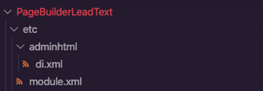
Even though we only have one appearance, the appearance_fieldset node is required. This is in case other modules need to add new appearances to the widget. To make sure this renders, we need to add a di.xml file to etc/adminhtml in the module.
The file ends up looking like this:
<?xml version="1.0"?>
<config xmlns:xsi="http://www.w3.org/2001/XMLSchema-instance"
xsi:noNamespaceSchemaLocation="urn:magento:framework:ObjectManager/etc/config.xsd">
<virtualType name="AppearanceSourceLeadText"
type="Magento\PageBuilder\Model\Source\VisualSelect">
<arguments>
<argument name="optionsSize" xsi:type="string">large</argument>
<argument name="optionsData" xsi:type="array">
<item name="0" xsi:type="array">
<item name="value" xsi:type="string">default</item>
<item name="title" xsi:type="string" translate="true">Default</item>
</item>
</argument>
</arguments>
</virtualType>
</config>
This ensures the appearance field builds correctly within the module. Like most forms within Magento, Page Builder requires fields to be grouped together in fieldsets. This provides Magento instructions on the name of your field grouping and the order it appears in the admin form.fields elements are used to create the physical form elements on the widget form. Near the bottom of this file, there is the following code to define our new field.
<field name="leadtext" sortOrder="10" formElement="textarea">
    <argument name="data" xsi:type="array">
        <item name="config" xsi:type="array">
            <item name="source" xsi:type="string">page</item>
        </item>
    </argument>
    <settings>
        <dataScope>leadtext</dataScope>
        <dataType>text</dataType>
        <label translate="true">LeadText</label>
    </settings>
</field>
This contains the data source that provides the link to a key in the data array that is returned by the \Magento\Framework\View\Element\UiComponent\DataProvider\DataProviderInterface::getData method in the ui component. Within the above snippet, the settings node defined three aspects:
- The
dataScopeis the name of the input field. This is used for data binding. - The
dataTypetells Page Builder what field element it should use to render on the form. - The
labelnode defines the text label for the input field.
Now the form is built, we need to tell Page Builder where to put it. Thankfully this file isn’t as big and looks very similar to standard Magento layout XML:
<?xml version="1.0"?>
<page xmlns:xsi="http://www.w3.org/2001/XMLSchema-instance" layout="admin-1column"
xsi:noNamespaceSchemaLocation="urn:magento:framework:View/Layout/etc/
page_configuration.xsd">
<update handle="styles"/>
<body>
<referenceContainer name="content">
<uiComponent name="pagebuilder_pinpoint_leadtext_form"/>
</referenceContainer>
</body>
</page>
The form is an extremely important part of creating the Page Builder widget, and I encourage you to read more about it or get in touch to chat with a member of our team.
Tying it together
Although we built this module, there are still further parts that were surplus to requirement to complete it that Page Builder can accept. For
example, there are components used when you need to customise the preview on the stage. You can add custom LESS/CSS to the component to expand the base appearance. You can also create custom CSS bindings that are linked to form elements so an administrator can select an option to add a class, rather than have to remember modifier classes.
An icon can also be added to the left-hand menu to help visually identify your widget faster. Again, these can be read about in the DevDocs
for Page Builder.
Next steps
Now that we have our new Page Builder widget in its own module with Magento, we can remove it from app/code and add it to a package management system such as Satis or Packagist. It can then be referenced in future composer.json files for further projects, should it be needed. To enable it to be used in composer, we need to add a composer.json file to the module.

Which would look like this:
{
"name": "pinpoint/leadtext",
"description": "A Magento 2 module for adding a leading paragraph to Page Builder.",
"type": "magento2-module",
"version": "0.0.1",
"license": [
"OSL-3.0",
"AFL-3.0"
],
"require": {
"php": "~5.5.0|~5.6.0|~7.0.0|~7.1.0|~7.2.0",
"magento/magento-composer-installer": "*"
},
"autoload": {
"files": [ "registration.php" ],
"psr-4": {
"Pinpoint\\PageBuilderLeadText\\": ""
}
}
}
The Outcome
The outcome of this exercise is that we now have a text field that can be specifically added to a page. The text can be entered either on the form, by hovering over the element on the stage and clicking the cog for its settings, or live, directly onto the stage.
We have a Magento certified development team who know the ins and outs of Magento’s features and functionality. Want to chat about your website project? Get in touch today or take a look at some of the eCommerce solutions we have crafted over the years.


