Elevating Donaghy Bros' digital presence
- Home & Garden
- Replatforming
- Adobe Commerce
- Design, UX & UI
- Integrations
Tags
The brief
With such growth comes the need to invest in and improve their eCommerce store. With ambitions to expand their UK audience, provide better functionality and offer an improved online experience for shoppers, they needed a platform that could support future growth. Originally on Magento 1, the decision was made to make the move to Magento 2. That’s where we came in.

The solution
Magento 2 was the flexible eCommerce solution Donaghy Bros needed. Building the site using our in-house boilerplate dramatically sped up the build time while still providing the required flexibility and functionality.
Customer, order and product data were all migrated with significant cleansing of the old data done to provide Donaghy Bros with a cleaner slate to work from.
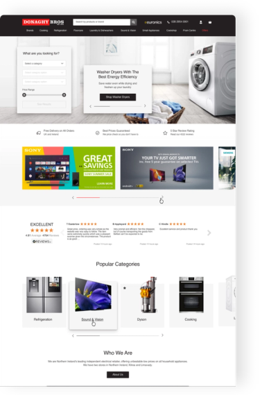
Alongside this, a clearer menu structure was implemented, and new ways were found to showcase Donaghy Bro’s USPs. Important to the website strategy, delivery timescales and various warranty options can now easily be promoted.
Custom attributes give even greater flexibility when it comes to displaying product information. With the ability to promote their extensive range of warranties on product pages, customers have greater choice, able to select their desired option.
Custom functionality was a must to meet Donaghy Bros’ objectives whilst further enhancing the user experience. To showcase the wide range of leading brands they stock, brand landing pages were created specific to each manufacturer. This empowered Donaghy Bros to use different content and layouts based on what they wanted to display for each brand rather than restricted a one-size-fits-all look and feel.
Not only does this help them create a better UX for their site visitors, but it also enables Donaghy Bros to meet the stringent requirements from the brands themselves.

Enhanced UX and control over both products and promotions
To drive further sales, promo slots were added to product pages for current promotions to be advertised and encourage shopper engagement.
With product feeds provided by their different manufacturers which include product information such as size and colours but give more control to Donaghy Bros, we built in the ability to adjust pricing and provided greater stock management capabilities.
With many of the product descriptions taken from third-party information, we found an SEO-friendly way to do this that would also support their organic visibility.
To take the user experience one step further, we needed the helping hand of well-known third parties. These included integrations with Klarna to introduce seamless payment options, Klevu for improved site search, Klaviyo for email marketing and the migration of Reviews.io from their Magento 1 store to continue building that all–important social proof. Hosted by Sonassi, Donaghy Bros now have a stable and secure eCommerce solution that will support them into the future.


