Streamlining Hell Bunny’s Navigation for Enhanced UX
- Adobe Commerce
- Retail
Tags
The brief
Suspecting that their Hell Bunny navigation was overcomplicated and busy, Popsoda wasn't sure how to change and condense it. They came to IDHL looking for our expert advice on how to improve their navigation and to ensure their customer experience and journey on the site was working for their target audience.
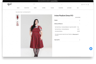
The key objective was to see how users navigated through their site and what barriers they faced. One of Hell Bunny’s USPs is their extensive size range, starting at XS and up to 6XL, so customers being able to find the correct sizing was paramount. On the Hell Bunny site, clothing is displayed on two different model sizes, plus size and non-plus size, and they wanted to gauge if users understood this.

The solution
Understanding how people were using the website was vital in implementing worthwhile updates to the site. We suggested remote user testing, whereby users answer questions and tasks while their screen is recorded and they think out loud, so we could take a deep dive into the customer buying journey. With specific goals in mind, we aimed to:
- Understand how users navigate through the website
- Test if users understand the size guide
- Gauge if users understand that the same products are merchandised twice on two different models
- Understand how users engage with site search
- Test the purchase journey to try and uncover potential barriers
We then took the user responses and analysed what was working well on the site and what could use a refresh. This information was presented back to Hell Bunny and used to tailor the website to their targeted audience.
Receiving some stellar feedback, testers were extremely complimentary about the site’s inclusivity with a range of sized models and were able to determine the difference between two identical dresses on the two models, a key objective given to us from Hell Bunny. However, there wasn’t an overall winner for the plus size testers, suggesting that the site should cater to both types of user (plus size and non-plus size) rather than focusing on one.
Popsoda were able to take this information and drive meaningful and worthwhile changes to their, already successful, site.

Utilising tree testing for clear navigation
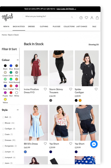
With clear navigation as the name of the game, we suggested refined and streamlined navigation for the Hell Bunny site. Before going live with any proposed changes, we advised user testing to ensure the changes would be beneficial to the site. It was fundamental that users could still find key products and categories before any changes were implemented. To check this, we set up a tree test.
Selecting those who meet the target users of Hell Bunny, we then provided 10 questions surrounding navigation to the testers. We provided each task with all the navigation options but assigned correct and incorrect answers to see what percentage of testers answered correctly. Questions such as ‘Where would you find a long sleeve t-shirt?’ and ‘Where would you find a short-length dress?’ were used.
From this, we were able to see if any areas of the new navigation worked well or not so well, and therefore may need further changes. With results showing that almost all users clicked into the correct first navigation category, but from there some users struggled to find the correct subcategory for several tasks, we then suggested further tweaks to combat this.
After the testing, we were able to recommend the new navigation be used on the Hell Bunny website, confident in the fact that users could still find essential products and services.


