Empowering growth for Lights4fun
- Shopify Plus
- Web & eCommerce
- Website development
- Design, UX & UI
- Replatforming
- Home & Garden
Tags
The brief
Held back by a bespoke eCommerce platform, Lights4fun needed to replatform to a stable and scalable solution. With global growth ambitions, they need to build foundations that would support them for the long term.
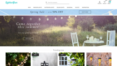
For phase 1: They wanted an elegant and streamlined user experience to showcase their extensive product range.
For phase 2: Lights4fun wanted to streamline their approach across their UK and US websites, and we collaborated to find a world-class solution.
Our primary challenge was to merge their separate codebases into a unified system. Additionally, we needed to standardise navigation and templates across both sites to achieve a cohesive design update. Given the distinct differences between the UK and US websites, our task was to identify and incorporate key design elements into a unified master template.
The solution
To achieve our goal for Phase 1, we delivered an enhanced store design that guides customers through a smooth shopping journey.
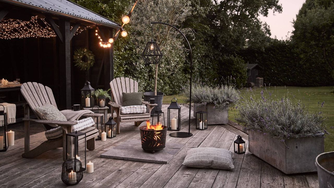
We leveraged inspiring lifestyle imagery to help customers select the best products for their homes. We presented product and delivery information clearly alongside user reviews and related products to enhance the shopping experience.
We integrated the Shopify Plus store with Light4Fun’s ERP, NetSuite, to ensure product, customer, and order information can be securely exchanged between platforms.
We launched international and B2B stores, allowing Light4Fun to fully embrace growth opportunities across all sales channels.
Website optimisation
For phase 2, we suggested performing user testing on both sites to see how users interacted with the UK and US websites. Understanding which areas of their sites worked and which didn’t was vital so we could assess how to merge the two layouts.
Remote tree testing was used to test navigation on site and how easily participants could find products/ pages. 10 questions were written and each task had all of the navigation options available but ‘correct’ and ‘incorrect’ were assigned to answers to give a percentage of correct usage
We used a form of user research called user testing where we recruit participants to perform a number of tasks and answer questions about the content and usability of the website. This helped us form the framework of which areas of the site the users preferred on which sites and why.
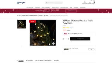
From the user testing research, we then designed a new product page which incorporated all the best elements of the two sites into one page. First-click testing was then used to see if testers could find key elements on the newly designed page.
First-click testing allowed us to see what tweaks could be made to increase visibility and functionality.
The results
Testers liked some elements of both sites so our solution was to blend these together and create a design that utilised the best of both worlds. We retested the new design to ensure users could find all the key elements on the page.
The final result saw the creation of a product page that Lights4fun were happy to proceed with, confident that it will perform due to the extensive testing we ran on both the current and new designs.
As Lights4fun continues to scale, our ongoing support services allow us to support the team in achieving their full potential on Shopify Plus.
